Friday 31 January 2014

Signing Off


The coursework unit for A2 Media Studies has been extremely demanding and stressful, but above all it's been fun.
I've learned a lot and developed very useful skills.
It's a time in my life that I think I'll remember for a long time.

Goodbye! :)

Evaluation #4

What have you learned from your audience feedback?


Audience feedback was also useful because it helped me decide which advertisement to use.

Evaluation #3

How did you use media technologies in the construction, research, planning and evaluation stages?

Contruction process:

Photoshop to make the digipak and advert


Final Cut Pro to edit the video


Research process:

YouTube to watch videos


Planning process:

Facebook to get extras for the video


Evaluation process:

Photoshop to make an analysis image of my products


Quicktime to watch the video back


To film the video we used a camera, lights and a fig-rig.

Evaluation #2

How effective is the combination of your main product [Video] and ancillary texts [digipak and advertisement]?


Overall, I feel that all my products have synergy and are tied nicely in together. They all have a sense of brand image and identity, and are easily recognisable to the audience. I think that my main product and ancillary products have been combined effectively to promote my artist to her target audience.

Evaluation #1

In what ways do your media products use, develop or challenge forms and conventions of real media products?

Thursday 30 January 2014

My Digipak

front/back/spine

inside

cd

inside with cd

Chosen Advertisement

After weighing up the pros and cons of each advertisement, and receiving feedback that was mainly in favour of this one, I decided that it would be the best to use.


My Advertisements

I made 2 different advertisements which both looked quite different. I liked them both in different ways and was unsure of which one to use.

Advertisement #1

I like the way this one matches the album cover; it's like a bigger version of it with text information on it. It provides synergy to both my digipak and advertisement. Also, people would identify the album cover in stores from it if they saw it in stores after seeing the advertisement. However, I feel like it may be too similar to my digipak cover, maybe there needs to be a little variation to make it interesting. I couldn't add a picture of the album cover to it as it is so similar to the advert, and it would look messy and confusing. Also, filling the frame with Eloise's face worked well for the digipak, however, with the advert being bigger and wider, it may look a bit intimidating. I need my advertisement to be opposite; inviting. I want people to be gently and politely invited into buying the product.
Following the idea of it needing to be inviting, I made another advertisement.

Advertisement #2:

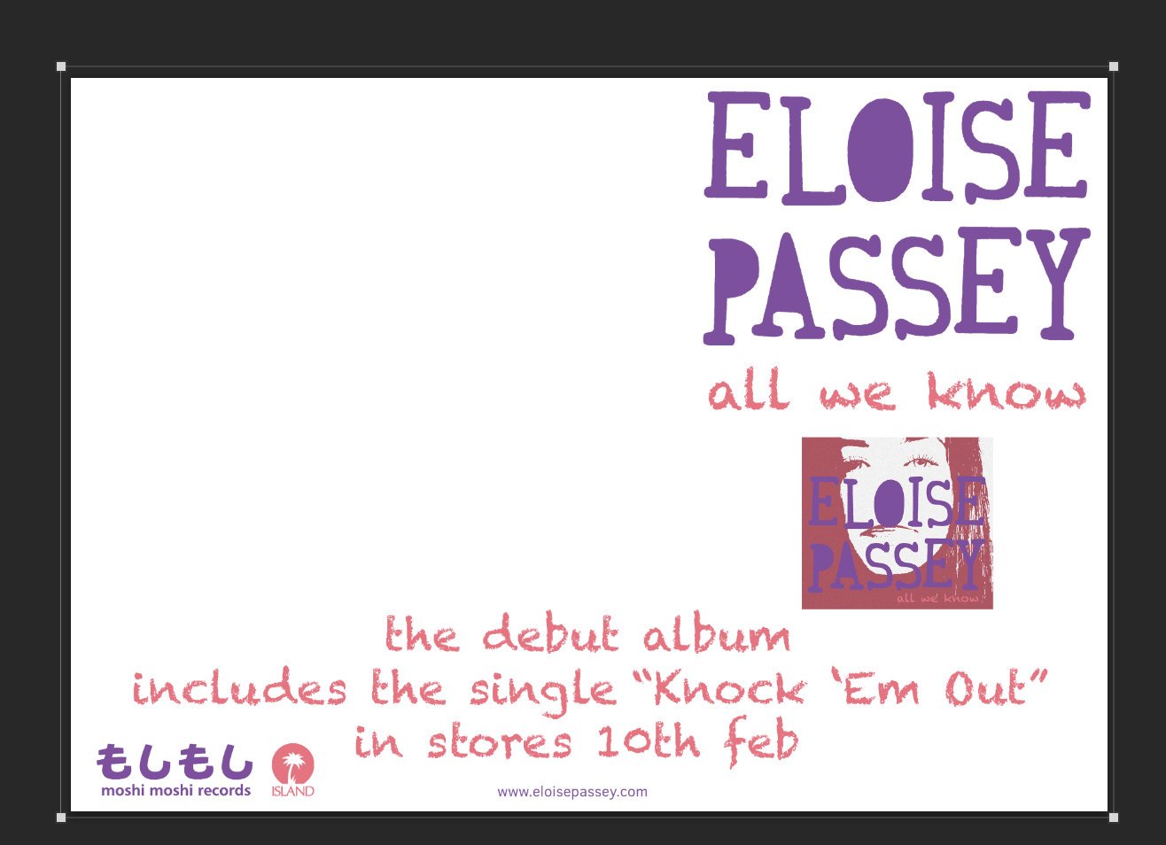
For this advertisement, I used the same photo as I did for the inside of my digipak. This still provides synergy, but in a less obvious, possibly more sophisticated way. I think this photo is great for use in advertising and trying to sell the product as it is friendly and inviting. It looks like a real, disposable camera photo taken at a party which is something that the audience can either relate to, or aspire to. I think it perfectly sells the idea of youth, fun and partying which is what our artist is about. This advertisement has also allowed me to use the album cover in it, which I think is a nice touch in album advertisements (all the best adverts I'd looked at had the album cover in a smallish square on them). This version has also allowed me to keep to the pink/purple colour theme (I had to have black writing on the other advert in order for it to stand out).

I decided to post them both on Facebook for people to give me feedback (on my timeline and on Lily Allen's page) so that I could get the opinions of my target audience which my friends list is full of, and the viewers of Lily Allen's page is full of.

Advertisement #2 in Production

I had 2 ideas so I decided to pursue them both.

Re-sizing the album cover to fit nicely onto the advert:

Adding a white rectangle, then changing the opacity to make the colouration of the photo even brighter and more authentic looking:


Advertisement in Production

Adding Text:

Colouring logo:


Digipak in Production

Making the logo transparent:

Adding effects to photo:

Adding text:

Colouring logo:

Making logo transparent:

Before adding effects to back:

Rotating logo and text for spine:

Editing the inside photo to brighten it and also make it look like a disposable camera photo to make it look authentic:


Audience Feedback

Seeing as my Facebook friends list is full of young people who fall into the bracket of my target audience, I decided to post my work on my timeline and Lily Allen's page to see what they thought of it and what I could improve.


The feedback was all very positive so I decided I wouldn't make any changes.

Wednesday 29 January 2014

Digipak Mock-up

I made a mock-up of roughly how I would like my digipak to look. When I make the real thing (digitally) I will develop it in many ways. For example, I might use a different font for Eloise's name, possibly her logo which was used in the music video as this will add synergy. I also might ad an effect to the photo to make it more interesting.


Photos I Plan To Use For My Digipak

This is a nice close-up photo of Eloise. She is looking straight at the camera and is faced forward. I have edited it (colouration, filters etc) and airbrushed imperfections in photoshop to make it ‘perfect’ which is what is expected for a pop digipak. Her facial expression is neutral; she isn’t showing any emotion, which makes her appear mysterious. This mysteriousness is good for a debut because nobody knows about her and it may make them want to find out. I think this would be perfect for the front of the digipak.


This is a photo from the music video shoot. It looks authentic, like a photo from an actual party. It conveys fun, youth and energy, and would be either something that the audience members can relate to from going to parties, or aspire to be. I edited it in photoshop to brighten it and make the colouration look warm and authentic, to make it seem like a disposable camera photo to give it  extra 'realism'. I think it would be perfect for the inside of the digipak as it is a nice image to greet the audience when they open it to take out the disc. It would also continue the party theme and tie in the music video with the digipak and make it synergous.

Photos from Photoshoot

These are the photos from the shoot that I feel turned out the best and would be the best for use on my digipak/advertisement. I wanted the photos that looked the most natural and authentic; like actual party photos.